A Look At Some Stunning Architecture
Rotating Bookcases Can Turn to Face Either of Two Rooms
 While lounging in the living room, you set your book back on the shelf to read later … then grab it off the shelf from your bedroom. Not magic, merely a bit of creative engineering with a twist. And consider the flip side: having a party in the living room, or want to clear you mind in the bedroom? No worries, you can spin yourself a blank wall on demand just as easily as you brought the bookcase into view in the first place.
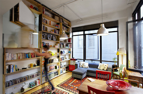
While lounging in the living room, you set your book back on the shelf to read later … then grab it off the shelf from your bedroom. Not magic, merely a bit of creative engineering with a twist. And consider the flip side: having a party in the living room, or want to clear you mind in the bedroom? No worries, you can spin yourself a blank wall on demand just as easily as you brought the bookcase into view in the first place.
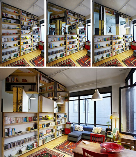
Via Inhabitat: “The UnWaste Bookcase is a brilliant sustainably designed full-wall rotating library created by architect Ben Milbourne (Bild Architecture), eco-designer Leyla Acaroglu (Eco Innovators) and furniture designer David Waterworth (Against the Grain).
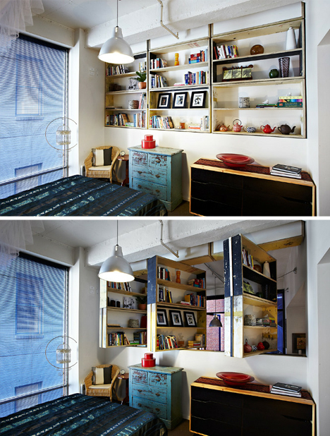
Aside from its neat rotational functionality, it also features engaging materiality. “The bookcase is manufactured from reclaimed plywood discarded from construction site hoardings, and the material’s unique characteristics of posters, weathering, graffiti and mismatched paints were incorporated into the design.” This kind of multi-dimensional collaborative project really shows that two (or three heads) is better than one.
Before & After Paint: 22 Home Furniture & Interior Photos
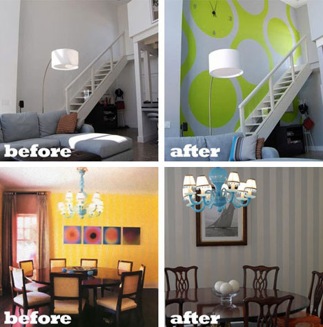
A little painting can go a long way toward transforming the look and feel of a space, so before you change the wallpaper or toss out your old furniture, consider some before-and-after project examples that show how a change in color can liven up a dull space or dampen an overly dramatic one.
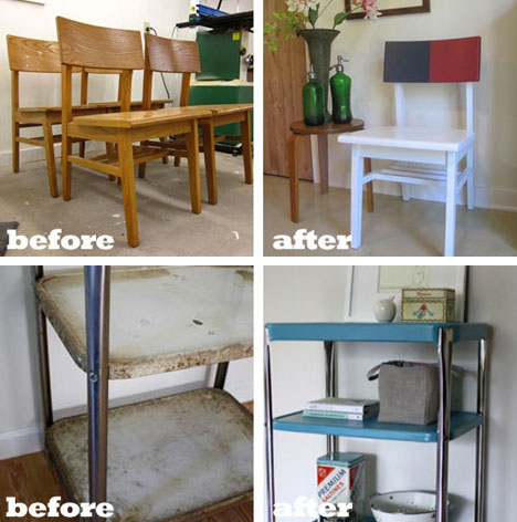
ApartmentTherapy covers such projects regularly, but individually they are not quite as interesting – after all, a blue, red and white chair may just not be your thing. Taken together, though, they show just how much you can alter character and mood with a change in tone or brightness.
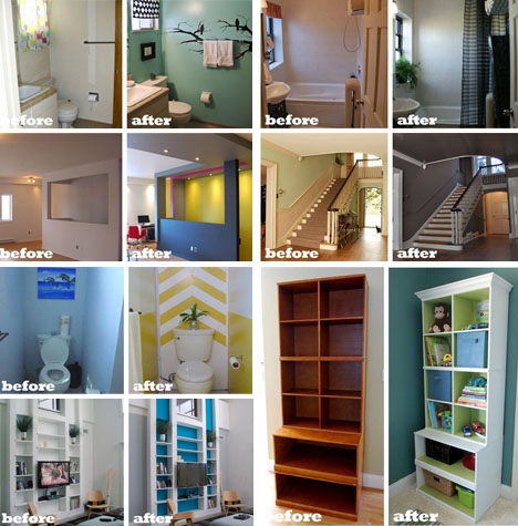
Bland bathrooms are just plain (and) uncomfortable – and too much white (or pastel) can kill an entry or living space. Highlights on the backs of wall bookshelves or free-standing bookcases can also help add dimension to a space by providing creative contrast.
How to Increase a Home's Usability
With buyers looking for homes that will be usable for years as their family needs evolve, design pros are stepping up to meet the challenge with a variety of flexible solutions.
When Creighton and Tracey Gibson built a ranch 15 years ago, Creighton’s job as owner of a franchise that offers nonmedical care and companionship to seniors made him sensitive to his own aging family members’ needs. Accordingly, the couple added some features to their North Carolina home to accommodate them when they moved in.
First, an extra bedroom with kitchenette and a bathroom with grab rails were put in when Creighton’s father moved in after a fall in 1998. After he died and Tracey’s mom, an amputee, couldn’t manage alone, the couple built a ramp at their front door for her wheelchair. The Gibsons have found the arrangement offers benefits to each generation, including for their 11-year-old daughter, who gained a live-in babysitter when she was young and now can offer companionship as she gets older.
Housing aging parents for health, safety, or to avoid loneliness as they’re living longer isn’t the only reason that home owners are altering floor plans:
▪ A rising immigrant population whose cultural traditions often encourage everyone to live under one roof is making the multiple-generation household more common.
▪ The difficult economy is spurring college graduates to do what was once unthinkable — move home and reclaim childhood bedrooms until they land a job or save enough money to be on their own. Ditto for young divorced adults, sometimes with a child in tow.
▪ The tough resale market is convincing empty-nesters to stay put and remodel homes to maximize unused space, including spare kids’ bedrooms.
Because of the differences in needs, ages, traditions, budgets, and property types, there’s not a single layout that works for a large cross-section of consumers, says Brian Brunhofer, president of Meritus Homes, a home builder in Deerfield, Ill. As a real estate professional, your job is to help buyers and sellers assess housing options for now and later with three major objectives in mind:
Incorporate Universally Appealing Universal Design
Any home — newly built or remodeled — should consider this concept as much as possible since it strives to make a home safe and useable for a variety of ages, abilities, gender, budgets, and physical challenges, says John Salmen, member of the American Institute of Architects and founder of Universal Designers & Consultants in Takoma Park, Md. Among its prime tenets:
▪ Easy circulation: Navigating space freely is key, whether people move among different levels or spaces on the same level, Salmen says. Doors and openings should be at least 32” wide for wheelchairs and walkers to get through. Elevators can eliminate stair climbing for those physically challenged or even for home owners needing to carry heavy groceries up stairs. Adding a two-stop model in an existing house might cost between $20,000 and $25,000, but leaving a 4’ by 5’ shaft, so equipment can be installed later if needed, would cost less than $5,000 initially, says Richard Bubnowski, design principal of his eponymous firm in Point Pleasant, N.J.
▪ Good illumination: Aging eyes need three to five times more light than people do at 18 years of age, says Salmen.
▪ Non-slippery floors and low-piled rugs: These help people of all ages avoid falls.
▪ Easy room and appliance access: Instead of knobs, levers facilitate opening doors for young and arthritic hands. Touch faucets allow easier access to water, particularly when hands are sticky or fingers also are arthritic.
▪ Movable storage: Placed under kitchen countertops, these can be rolled away to allow home owners to sit in a traditional chair or wheelchair.
▪ Zero-step entrances: Whether crossing a main door or walking into a shower, these make traversing spaces carefree.
▪ Discreet grab bars: These eliminate an institutional look and can mimic wainscoting or any trim, says Lake Bluff, Ill.-based builder Orren Pickell.
Maximize Existing Space to Avoid Expensive Additions
Before adding space, home owners should make better use of what they have, says designer Marianne Cusato, author of Get Your House Right (Sterling Publishing, 2008). “Perhaps there’s stuff that can be put away with affordable storage purchased at places like IKEA, or a rarely used dining room that can become an office,” she says. Other ideas include:
▪ Transforming basements and attics: When houses include these levels, typically unfinished, converting them can cost less than adding on to a first floor, says Pickell. The main expenses may be a nicer stairway; stronger floor or subfloor; better insulation, ventilation, and windows; plumbing for a bathroom; and an outside egress to meet building codes.
▪ Converting dens, family rooms, and garages: These main floor spaces can be remodeled into a bedroom for full- or part-time use for someone not able to climb stairs, and a nearby powder room can be remodeled to accommodate a shower if there’s space, says Elizabeth M. Sorensen with Dale Sorensen Real Estate in Vero Beach, Fla. When a door to the outside can be built, the suite becomes more desirable and private, says Brunhofer. Adding this type of suite can cost less than a year at a nursing home, says Michigan designer Leslie Hart-Davidson. “Home owners should think in terms of long-term savings,” she says.
▪ Rethinking empty bedrooms: For home owners whose children aren’t returning, Hart-Davidson transforms bedrooms into gyms, hobby rooms, offices, and walk-in storage.
▪ Melding indoors and outdoors: Homes become more usable and enjoyable by opening them to the outdoors through large windows and walls that provide a visual and physical connection, says Irvine, Calif.-based architect Robert Hidey. The outdoor areas themselves become more room-like and functional when designed with distinct areas to cook, sit, and dine, preferably with a “roof” and “walls” to screen hot sun, rain, and bugs, he says.
Build New to Meet Needs for the Long Haul
Constructing a new home from the get-go to meet a range of life stages helps avoid expensive alterations. Among the most usable designs:
▪ Hip ranches: Popular after World War II as new suburbs sprouted, they’re attracting attention again since they offer a cost-effective plan and main-level master suite. Brunhofer estimates the layout may run 10 to 15 percent less than a comparable two-story home. His firm sometimes adds a second master bedroom for future family needs.
▪ Loft-style plans: Whatever the house style, Bubnowski advocates one open sweep inside for living, eating, and cooking. So does Colleen Reardon, manager and sales associate at K. Hovnanian Homes in Orlando, Fla., which conducts extensive research and has seen interest also in open ceilings and bigger living spaces.
▪ The “New Economy Home”: Cusato’s efficiently scaled 1,771 square-foot, two-story “New Economy Home” was planned with the latest demographic trends in mind. The house is compact, so it costs less to build and is easier to maintain than most other homes, and features one master suite upstairs and a second one downstairs off the kitchen with an adjacent bathroom and back door to a porch and the outdoors.
▪ Bonus rooms: Once built above a garage for myriad uses, the bonus room is back, as it’s able to change functions as family needs demand. Today it’s a playroom; tomorrow it’s a home office or gym.
▪ Ancillary cottages: When land, budget, and codes permit, some home owners build a separate structure away from the main house, says Cusato. These detached bungalows or casitas are a way to gain a separate living or work space for family or a hideaway for guests who stay a while, says Hidey.
10 design flaws in the average home
 Good design doesn’t have to be froufrou. It can be simple and useful in its beauty, making use of natural elements. Often it’s a matter of looking to things that are important to you apart from conventional ideas and to what the idea of home means to you and your family.
Poor planning and small budgets can lead to design mistakes, but often flaws become apparent as newer and better ways of home planning and construction come into favor.
We’ve chosen 10 common design flaws to highlight in this article, listed in no particular order. If you find some of these problems in your home, take heart. You’re not alone, and there are ways to resolve the situation. Carpenters and handymen have been around for thousands of years, and many do-it-yourself experts learned about home improvement while coming up with workable solutions for design flaws and getting hooked on the problem solving itself.
Read more here.


