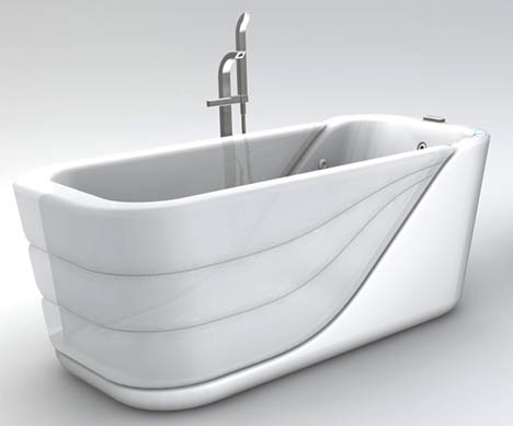
 Designers have a difficult time making walk-in tubs look anything but, well, ugly. There are a lot of requirements (like size) that lead to a default solution that seems clunky in an otherwise-nice bathroom space.


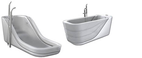
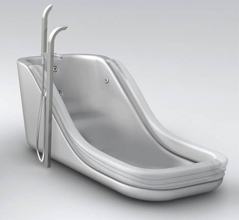
This solution by Su Pin Chia works around these issues in a few interesting ways. First, its strong horizontals and divided sections break up the monotony of the megalithic form. Second, when not in use, it is simply much smaller since the sides can remain down rather than up. Finally, the use of two materials – one hard, one soft – make it seem more like two elements than one.

So how does it work? Instead of folding up, it fills up – the sides are inflatable via the water-propelled jacuzzi mechanism already built in. Whether it would work in reality is a good question, but the concept is quite cool regardless.
Speak Your Mind