 front to back by a central atrium, this sleek and cool family home in Canada has a unique design in more ways than one
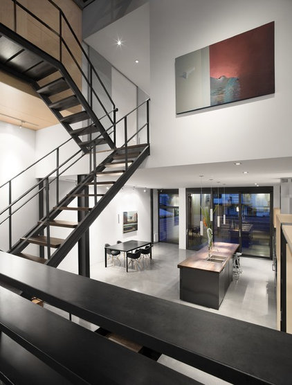
This multilevel family home designed by architect Natalie Dionne is unlike its neighbors in many ways. For starters, the floors in the house are staggered on either side of a central atrium that splits the house into two parts: front and back. The skeletal base linking the levels is also unique: It’s a staircase that marries natural steel and walnut and leads to a terrace on the top floor and a mezzanine level. The resulting house is sleek and cool, energized and warmed by a top-floor skylight that fills each level with natural light.
Who lives here: A creative couple who work in theater, film and television, and their children
Location: Montreal, Canada
Size: 3,229 square feet
by Natalie Dionne Architecture
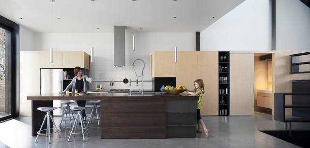
Models in these photos (shot before the family moved in) remind us that the house belongs to a family with teenage children, who can easily belly up to the island countertop table and appreciate the informality of bar stool dining. The swanlike commercial faucet is the centerpiece — and hardest-working part — of the modern kitchen.
by Natalie Dionne Architecture
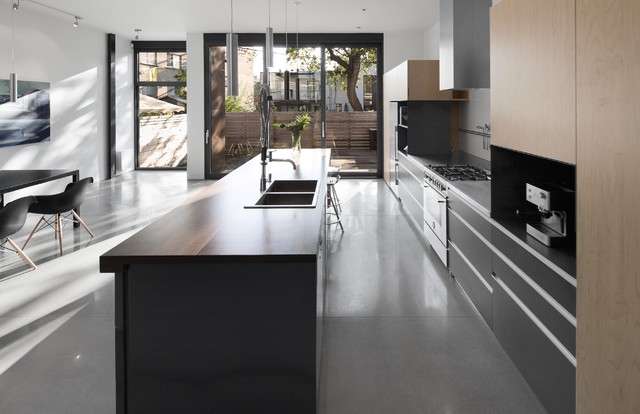
Floor-to-ceiling windows and sliding doors form an easy connection between outdoor and indoor living spaces; they also ensure that light floods the space, giving the polished concrete floors a gorgeous sheen. Flush cabinetry hugs the walls.
by Natalie Dionne Architecture
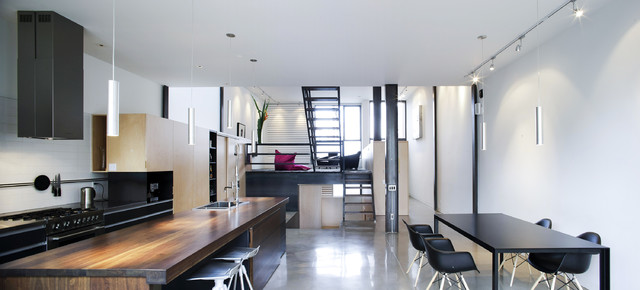
This photo shows the home’s staggered layout. A magenta Fatboy beanbag gives a rare splash of color in an otherwise neutral interior palette.
by Natalie Dionne Architecture
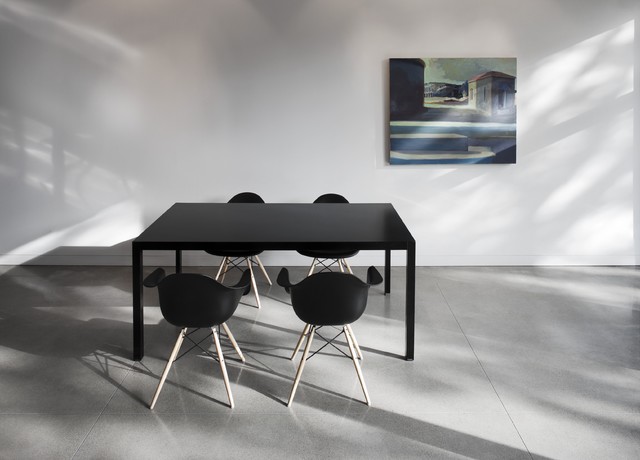
Black molded Eames chairs with contrasting wood legs cast dramatic shadows. The black-on-black dining area setup against the white and gray room reflects the sleek spirit of the rest of the house.
by Natalie Dionne Architecture
The steel used in the window and door frames, the table bases and the exterior facade is carried out in a staircase that links each level.
by Natalie Dionne Architecture
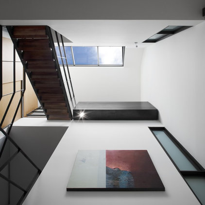
Abstract art fills what would otherwise be empty white space. The artwork forces us to look up to the skylight, the focal point of this vertical plane.
by Natalie Dionne Architecture
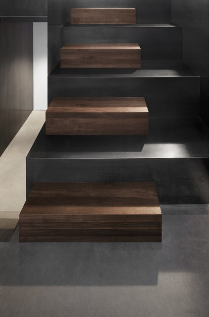
The staircase mixes walnut and steel. The contrast of espresso and ebony tones is gorgeous, with the steps looking like art installations.
by Natalie Dionne Architecture
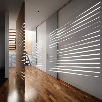
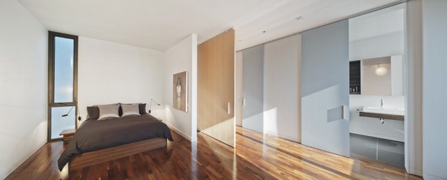
Wide sliding doors expand the bedroom space, allowing light to enter and adding plenty of intrigue to the expansive opposing walls.
Here, the sliding door partially divides the bedroom (at left of image) from the hallway. When the doors are closed, the space allows for privacy and contemplation.
by Natalie Dionne Architecture
When the doors are closed, the bedroom is completely separated from the outside. One of the other sliding doors in the hallway opens up into a bathroom as polished and modern as the living spaces.
by Natalie Dionne Architecture
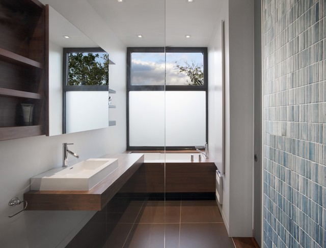
Partially frosted windows give plenty of privacy in the bath. The vanity mirror slides, revealing more storage space for toiletries and daily necessities.
by Natalie Dionne Architecture
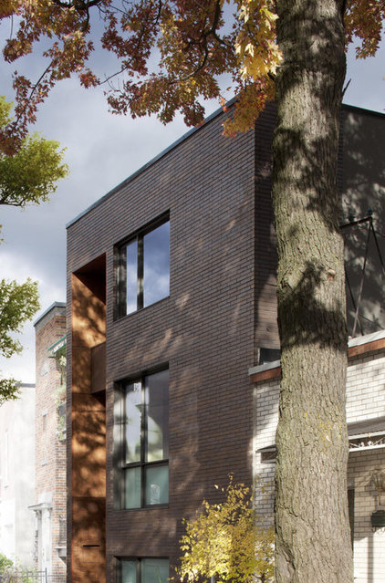
The home’s back entrance is as unassuming and modern as the interiors. It’s marked by a marine-grade plywood alcove stained an espresso color and seems to retreat into the house.
Speak Your Mind