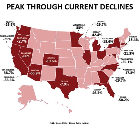
The graphic depicts pricing of all homes from their ‘peak through current declines’ as per Case Shiller. This index looks at prices in 20 major metropolitan areas. Keep in mind that for what is categorized as “Seattle” is comprised of Snohomish, King and Pierce Counties.
Each market peaked at different times. Therefore, the InfoGraphic doesn’t cover one segment of time. Here is a site where you can see when each market actually peaked:

Speak Your Mind