Skateboard House

PAS House Skateboard House

The PAS House is the project of a private residence, to be built in Malibu, California. In this house you will be able to skateboard any areas and surfaces, Indoor and Outdoor.

“Each space is skateable as the ground becomes the wall then the ceiling in a continuous surface forming a tube of a 10ft radius. The furniture is also skateable, whether it is integrated in the curve like the sitting area, the kitchen or the bathroom or just as standing object like the dining table, the kitchen Island or the bed. Closets and drawers could be integrated in the curve too. The PAS house is the first house designed to be entirely used for skateboarding as well as being a traditional dwelling. It is the ultimate dream for generations of skateboarders who wanted to bring their practice into their home. “

If you or someone you know is looking for a home for a skateboarder, skater, cook, craft person, artist, soccer player…. you get the idea. I can help! Emmanuel@EmmanuelFonte.com
Piano House

Piano House
27
32
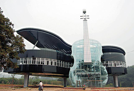
Piano House

The Piano House located in Huainan City, An Hui Province, China. It contains a transparent violin and a piano building. Inside the violin, there is staircase toward the piano house upstairs.

This building built for music lovers acts as a performance and practicing place to music students from the local college in Huainan City, east China. It also displays various city plans and development prospects in an effort to draw interest into the recently developed area.

Via: letmebeinspired.com

Interior design trend: vintage eco-friendly pieces

vintage interior design Interior design trend spotting: vintage eco friendly pieces

Photo courtesy of Jane Hall Design.

Stunning vintage pieces

We recently profiled Jane Hall, the “Voice of Style” for her innovative use of the color black in her interior designs. We were so inspired with her design and noticed she leaned toward putting amazing vintage pieces and antiques with modern decor with stunning results.

Hall said, “I love the concept of homeowners using vintage furniture for a number of reasons. Its green design and quite frankly built to last. With 95% of the furniture on the market today being made in China from press board and staples, in unregulated factories, this was not built to last. I call it throw away furniture. Its also cheaper to make it in 6 shades of gray and beige, chocolate brown and black and it cheaper to make things square than it is to make them round.”

Vintage doesn’t just happen, it takes planning

We understand from Hall that vintage is not exactly cut and dry and that a great deal of thought must be put into its execution (hence why she is in such high demand, we presume).

“There are many decorating styles that lend themselves to vintage furniture. I would recommend readers to do some research about what era they are trying to achieve before going out and throwing anything into the back of their car. As in all design projects, I always start off with a plan with my clients, so you don’t buy items that don,t contribute to your overall plan, just because they are are a deal or they are on sale.These are a couple of examples.”

Vintage styles

Hall outlined two primary ways to incorporate vintage style into a home.

Shabby Chic: Country pieces from can be painted white and distressed and look great with white linens on the bed, crystal chandeliers pale grayed off pastels on the walls Iron bed frames painted white, oversize couches in a cotton canvas cloth. Sisal rugs, on light stained hardwood floors keep the look light and casual.

Mid Century Modern: This a huge trend in the vintage market, with the the last 15 year craze being about modern design. Done properly with authenticity Mid Century Modern can be a great look. What people tend to forget, is that during the 50′s and 60′s color was used. As it was the post war years , they were doing a lot of experimenting with new materials in flooring, new fabrics, plastics and colour was a part of that experimenting. If you have seen Madman it’s fabulous early 60′s design.

Hall says that when flea market shopping, she looks out for shape first and foremost and ignores fabric, color or wood condition. “All that can be changed. Painted, reupholstered in contemporary or new fabrics or wood pieces painted, you can have pieces that are totally unique and are eco friendly.”

More Jane Hall Design designs:

If you’re enthusiastic about vintage design, check out the shots Hall sent us a variety of her pieces:

vintage design 1 Interior design trend spotting: vintage eco friendly pieces
IMG 7814 Interior design trend spotting: vintage eco friendly pieces
IMG 7600 Interior design trend spotting: vintage eco friendly pieces
IMG 4972 Interior design trend spotting: vintage eco friendly pieces
IMG 5173 Interior design trend spotting: vintage eco friendly pieces

Jazz album covers come to life in “Hi-Fi”

One of the saddest parts of albums disappearing was the loss of incredible cover art that could tell a story before the cellophane ever came off and the album hit the turntable.

Bante brings to life the jazz album covers of Blue Note Records in this 2009 promo video, “Hi-Fi.”

Long live album art!

Acoustic Decor: Modular Interactive Music-Making Furniture


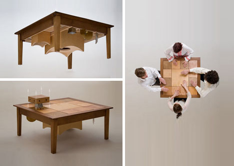
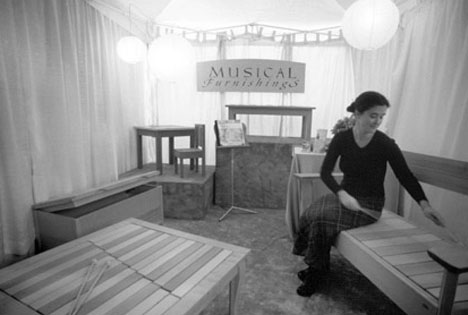
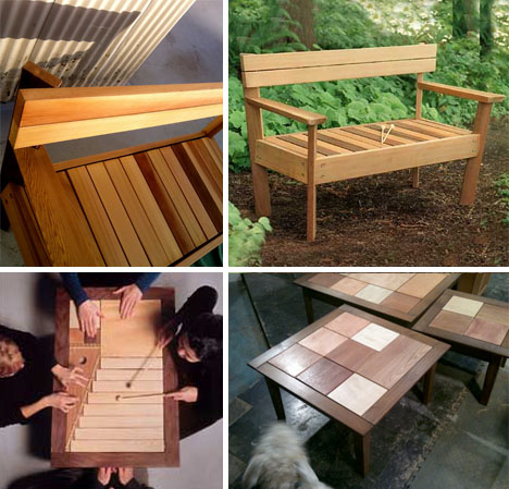
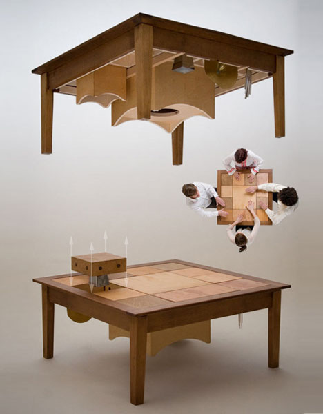
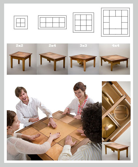
From chairs and benches to chests and tables, these modestly elegant objects are crafted with a subtle secondary purpose – each one can be tapped, slapped, pounded or hit to create a series of carefully-planned sounds.

Tor Clausen makes his interactive musical furniture out of his warehouse studio in nearby Olympia, Washington. You have got to see his work at MusicalFurnishings.com

He shapes everything from simple instruments to complex objects that have appeared in childhood learning centers, science museums, parks and homes around the country since he started adding acoustics to his craft two decades ago.

In his Rumba series of low-height tables, modulated music issues forth from different panels that can be rearranged as desired.

Each is distinguishable via different woods used and sounds made, including low, medium and high bong, shaker, chimes, bells, drums and cymbals created using combinations of carved wood and shaped metal.

15 Fantastic Photo-Edited Dream Home Ideas

Would would your dream house look like if you could create architecture without structural limits, geographical borders and cost or client boundaries? It might look something like the myriad creations of Worth1000 users made for a photo-editing contest series aptly hybridizing the terms ‘bizarre’ and ‘architecture’.

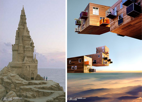
Take structural integrity out of the equation and one can construct a sky-scraping sand castle the likes of which the world has never seen. Subtract gravity and cool cantilevered volumes can now literally float up into the air, mingling with cloud layers above. (Via Bizarrchitecture 3)

Material remixes are popular as well, with submissions that combine ultramodern architecture and ice flows, or water towers and castles, stone caves and prefab pods and more. (Via Bizarrchitecture 4)

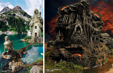
Architectural hybrids turn familiar structures into novel forms, converting known sculptures into giant-sized dwellings, for instance, or infusing a famous building, with active red-hot volcanic mass. (Via Bizarrchitecture 7)

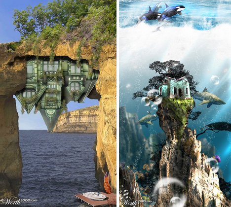
While you may not see an upside-down home with a private helipad, or an underwater dwelling with wood siding anytime soon, practicing architects could stand to learn a thing or two from such periodic forays into fantastical and physically impossible design. More such adventurous explorations and fantasy illustrations of built environments and dream dwellings can be found at Worth1000.

The Emerald City – Two Short Films

Take a look at our beautiful city – Seattle

“Last year I went to Seattle to shoot a commercial spot with the Deadliest Catch Captains. Seattle is one of my favorite spots in the U.S.A. – so I booked a few extra days and drove around the area shooting B-Roll for a few days. ” – Joel E.

Here is a collection of some nightfall sequences of the past year, mostly shot around downtown Seattle

Live in a library

Japanese architect Kayuza Morita designed a 557-square-foot home that is fit for a librarian. Floor-to-ceiling and wall-to-wall shelving define this small home in Osaka prefecture, Japan, that was created for a young historian who collects books in Islamic history. Laminated pine boards interlock, forming a lattice of shelving units for bound words or nicknacks.

Morita integrated the individual shelf unit in every aspect of construction. His goal was to create the “geometrical harmony” reminiscent of Islamic architecture.

The uniqueness of this “shelf-pod” house goes beyond the fact that it’s fit for a bibliophile. The structure can also support 10 tons of books and survive earthquakes. For Morita, creating houses on a smaller scale is essential for densely populated cities in Japan where space is limited. The movement toward smaller, greener houses makes sense not just in Japan but also around the globe.

An Orchestra Instruments [Interactive]

2011-07-05_1405

Very cool interactive orchestra map. Click to let your kids discover…