Genius Spanish Solar Pavilion Innovates Customized Prefabrication

solar_houseThe collaboration between the Institute for Advanced Architecture of Catalonia (IAAC) and leading multinational company in the Spanish electricity sector Endesa resulted in the construction of an innovative solar structure that will adorn the Barcelona’s Marina Pier for one year. Part of the Smart City Expo, the Endesa Pavilion (also known as Solar House 2.0 ) is describes as ” a testbed for informational grid technologies“. Combining prefabricated technologies with perfectly adapted customization, this genius design built in just one month is software-designed, cut to dimensions and assembled into a place-specific design. Plywood wedges shape outside solar system supports and interior storage spaces, while their cantilevering features shade the interiors from gaining too much heat in the summer.

Endesa Pavilion 1 Genius Spanish Solar Pavilion Innovates Customized Prefabrication

Endesa Pavilion 2 Genius Spanish Solar Pavilion Innovates Customized Prefabrication

Summarizing the project, IAAC explains the modularity, versatility and functional features of the pavilion: “The project is an exercise in which a building, under the guidance of the block type of Barcelona, is adapted by adding a series of modules on its facade. These modules, which are seen as triangular pieces section, make possible for the building to optimize energy and spatial intelligence. Its size and components vary depending on the orientation and inclination of the sun, the relationship with the environment and other technical needs.” Scroll down to see two videos – one presenting the pavilion from multiple angles and the second one explaining the ideas and technologies behind the exceptional project.

Endesa Pavilion 3 Genius Spanish Solar Pavilion Innovates Customized Prefabrication

Endesa Pavilion 4 Genius Spanish Solar Pavilion Innovates Customized Prefabrication

[pb_vidembed title=”” caption=”” url=”http://vimeo.com/46509301″ type=”vem” w=”600″ h=”338″]

Endesa Pavilion 5 Genius Spanish Solar Pavilion Innovates Customized Prefabrication

Endesa Pavilion 6 Genius Spanish Solar Pavilion Innovates Customized Prefabrication

Endesa Pavilion 7 Genius Spanish Solar Pavilion Innovates Customized Prefabrication

Endesa Pavilion 8 Genius Spanish Solar Pavilion Innovates Customized Prefabrication

Endesa Pavilion 9 Genius Spanish Solar Pavilion Innovates Customized Prefabrication

Endesa Pavilion 10 Genius Spanish Solar Pavilion Innovates Customized Prefabrication

Endesa Pavilion 11 Genius Spanish Solar Pavilion Innovates Customized Prefabrication

Endesa Pavilion 12 Genius Spanish Solar Pavilion Innovates Customized Prefabrication


Endesa Pavilion 13 Genius Spanish Solar Pavilion Innovates Customized Prefabrication

Endesa Pavilion 14 Genius Spanish Solar Pavilion Innovates Customized Prefabrication

Endesa Pavilion 15 Genius Spanish Solar Pavilion Innovates Customized Prefabrication

Endesa Pavilion 16 Genius Spanish Solar Pavilion Innovates Customized Prefabrication

Endesa Pavilion 17 Genius Spanish Solar Pavilion Innovates Customized Prefabrication

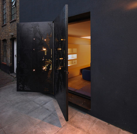
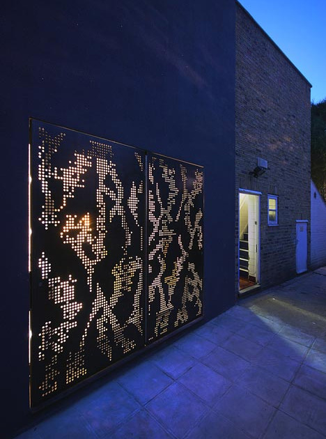
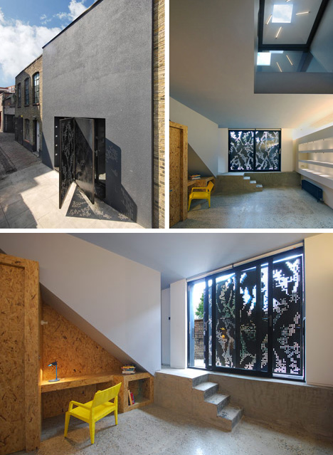
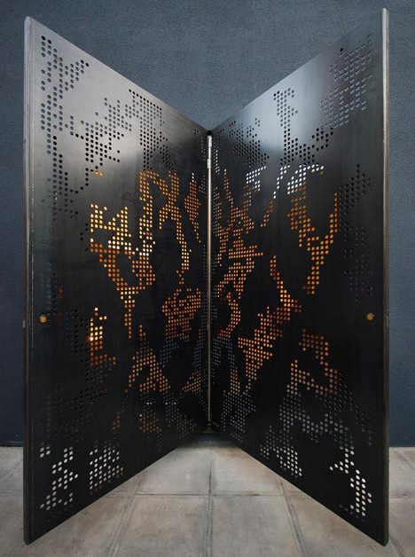
Perforated Steel Mixes Light & Mystery in Windows & Doors

metal-butterfly-door-nightToo often, doors are more of an afterthought for designers, even though they are the first piece of a home we are confronted with, and the last impression when we leave.

Dubbed Hidden House by Teatum+Teatum (images by Lyndon Douglas), there is a stark austerity to this structure, making the decorative perforations in the butterfly-winged pair of front doors all the more apparent as a decorative touch.

Limited windows and a light well bring in illumination from above and behind, but to maintain privacy the side openings, front and back, are dotted with small openings in larger steel panels.

The structure itself acts as neutral infill between two older buildings, deferential and dark while also comfortably modern.

A Modern Home Finds Its Soul

houseInterior designer Andrew Mitchell toes the fine line beween design constraint and generosity in this Brighton, Australia, home. Called by clients who wanted to inject their home with more warmth and character, the designer brought in texture and materials without layering in too much old with the new. "Achieving balance between the sleek, modern bones of the house and adding character and soul is not an easy thing to do," says Mitchell. A slow and deliberate introduction of natural materials, including recycled Australian hardwoods and fabrics, softened what used to be a slightly steely interior.

A Floating House On Lake Union

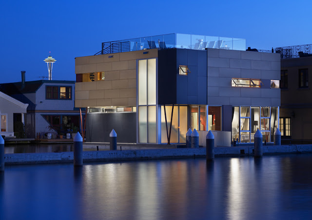
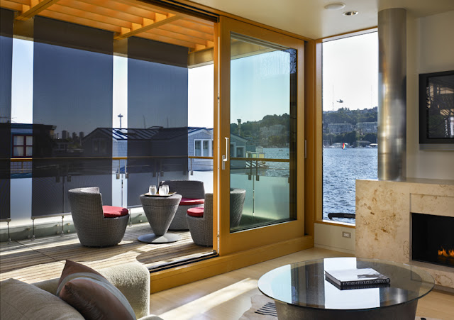
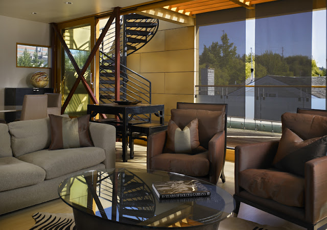
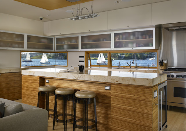
lake-union-floating-homeThis is the latest project of V + C Architects (Vandeventer + Carlander). This private residence floats on Lake Union in Seattle and offers great panoramic views of downtown Seattle southward, Gas Works Park to the north and Queen Anne Hill to the west. With no space to spare, the home has a compact waterprint and easily combines indoor and outdoor living. The customers required a home that was modern and would meet their needs for comfortable living and gracious entertaining. The result is a design that turns the traditional floor plan upside down with the personal rooms on the ground (or may be water floor is correct?) floor and public spaces on the roof. A spiral staircase leads up to the rooftop deck for even more glorious views.

Living on the water comes with its own sets of challenges, namely the effects of water corrosion on buildings and vehicles. To minimize those effects, the architects designed the home to be low maintenance and durable, which includes the use of aluminum coverage and fiber cement panels for a rain screen. Inside interior materials were chosen for their color palette, which includes the use of light hued bamboo flooring. Solar passive design, natural daylighting and ventilation all help reduce energy use within the home. Overhangs and sun shades protect the interior from overheating in the summer. In addition, the home features a hydronic in-floor heating with an energy efficient heat pump system and a fresh air ventilation system with an energy saving heat exchanger.

via:vc-arch.com source

The 4 Things Home Buyers Really Want in Kitchen Cabinetry

kitchenA great kitchen design can dramatically increase your property value — if you want to attract prospective buyers, your kitchen is the perfect place to invest money. The trick is to get it to appeal to the majority of people by spending your money on what most of them really want.

Kitchen cabinetry can do much to attract the right buyers. There are four key factors to consider: quality, symmetry, color and layout. If you can get these key elements right with your cabinetry, you’re bound to have a higher home value.

Wonderful Wood Countertops for Kitchen and Bath

wood_sinkDo you think wood counters in the bathroom or kitchen and kids don’t mix? Well, it ain’t necessarily so. I decided to do some research on what people with wood countertops really think about their care and maintenance. I went to several discussion threads on multiple websites and read through all the comments. Of the people who have had wood countertops in a kitchen or bathroom, around 90 percent of the comments I read were positive, and many of those commenters have kids of every age. It was surprising, given how many folks are afraid to put wood in a kitchen or bath. In reading through all of these people’s comments on their personal experiences I found two common things that contributed to success or failure:

The kind of sealer used

The type of wood and the quality of construction

Wood is such a beautiful material and adds such visual warmth. If you are longing to incorporate wood into your kitchen or bath, but fears about care and maintenance are keeping you from it, there just may be a solution for you in here.

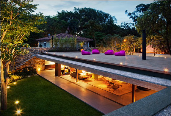
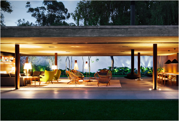
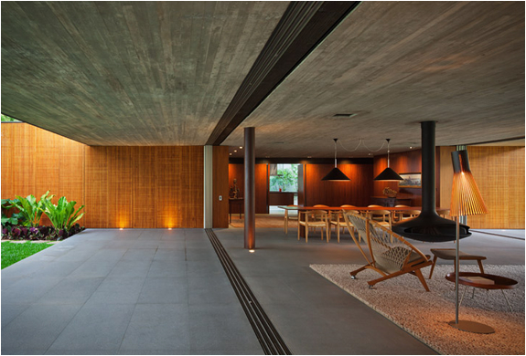
Wall-less House | BY MARCIO KOGAN

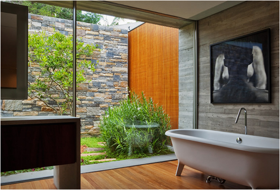
Emmanuel FonteThis has to be one of the most amazing properties we have come across this year. The “V4 House” in Sao Paulo – Brazil, was designed by renown Architect Marcio Kogan. The main feature is the lack of walls, making the interior flow effortlessly onto the lush outside environment. The stunning property has not gone unnoticed in the architectural world, it has been nominated under the House category of the 2012 World Architecture Festival.
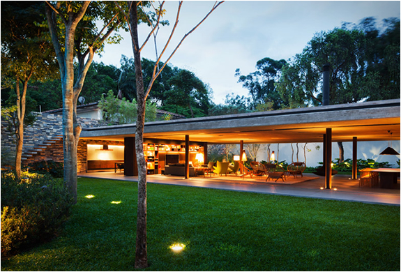
v4-house-studio-mk27-2.jpg
V4 HOUSE | BY MARCIO KOGAN | Imagev4-house-studio-mk27-3.jpgv4-house-studio-mk27-4.jpgv4-house-studio-mk27-5.jpg

3 Wondrously Wood-Loving Modern Structures

woodThese three projects — a house, a yoga studio and a workshop in a garden — have one important material in common: wood. Each space derives its character from wood, and in the process the three projects share commonalities that go beyond the way the spaces are aligned with wood.

The material choice seems to be derived from the location, something each designer takes advantage of. Inside and outside are strongly linked in each case, a result of wooded sites and the decision to build with wood.

Architectural Oddities Throw Home Design a Curveball

cool_houseAmong the hundreds of thousands of home photos on Houzz, most fall into a few broad stylistic categories. Designs rooted in traditional styles tend to predominate, and modern houses get their fair share, even though the two camps can rarely agree. Even in the eclectic category, many of the buildings are still very similar to traditional or modern/contemporary houses, with slight idiosyncrasies.

But what about the truly odd? Showing some of these houses was my goal in this ideabook, and thankfully, I’ve found a few.