Modern Earth Shelter: Homes Built into the Hillside

Rather than attempting to transcend vernacular architecture, BAUEN architecture studio has embraced its wisdom for two homes that sit side-by-side in Luque, Paraguay. The homes are thoroughly modern, but utilize an ancient earth-sheltered tradition to work in harmony with the hot, humid tropical climate of the area.

From certain angles, the homes are almost entirely hidden behind hills, their curved roofs mimicking the grassy shapes around them. BAUEN used the earth that was displaced in constructing the homes to build artificial hills  that embrace the modern structures, stabilizing the temperature inside with the thermal inertia of underground spaces. This technique reduces the need for energy-intensive air conditioning.

Both homes feature lots of glass both on the upper levels, and on the wall facing the yard, to fill the interiors with light in spite of the subterranean design. Differing slightly from one home to the other, the aesthetics call to mind both ultramodern architecture and architectural typologies of the distant past.

“The ‘Culata Jovai’ or ‘House of Confronted Rooms’ is a real bioclimatic solution belonging to one of our traditional ways of living in harmony with the environment in Paraguay, and constitutes our base typology for a new reinterpretation according to new functional programs, needs of symbolic representation and new technologies, framed in a sustainable project,” say the architects.

Stacked Hillside House Balances Beach Views with Privacy

The ability to take in views of a beautiful beach in Australia is balanced with a family’s desire for privacy in the white concrete Hewlett House by MPRDG architects. A striking contrast to the more conventional homes that surround it, this modern concrete residence consists of stacked geometric stories connected by a shell-shaped staircase.

The rectangular home gets a sense of movement and enhanced visual interest from the dramatic staircase as well as a privacy screen on the upper story that is inspired by the shapes of the eucalyptus tree branches around it.

The lowest floor is built partially into the hillside, with a rock wall that gives it a cave-like atmosphere. This floor houses a recreation room leading out to the swimming pool and garden. The bedrooms are tucked away in the middle floor, while the upper story is reserved for common spaces to take full advantage of the views.

While the plentiful glass and open-air terraces focus the view beyond neighboring houses to the nearby Bronte beach, the rooms inside are arranged for maximum privacy.

7 Superb Designer Kitchen Setups

The main design elements of the household kitchen have remained more or less the same for many decades, but the Philippe Starckcollection from Warendorf are surprisingly fresh and different.

The Starck collection takes kitchen design in a rather unexpected direction. The collection features the combination of kitchen functions with elements of different rooms.

In one design, the kitchen takes on the functionality of a library as well. The inclusion of tall shelves and even a rolling library ladder give the kitchen dual purposes as well as an unusually sophisticated aesthetic.

Another of Starck’s designs includes a rotating tower kitchen which contains everything one needs to have a fully functional kitchen: water, a stove, a fridge and a microwave are all contained in this tower kitchen design, along with plenty of storage space.

The kitchen designs from Starck and Warendorf go to show that even small-space kitchens can be eye-catching and completely functional.

source: dornob.com

Glamourous Glass House is a Luxury Retreat

An elevated glass koi pond, a sleek suspended porte cochere and the semi-circular facade of this luxury home in South Africa are dramatically framed by towering beams. Glass House by Nico Van Der Meulen Architects is a dynamic space full of transparent walls, with an open interior that welcomes in sunlight and views of the tranquil backyard.

The suspended glass and steel portico leading into the structure has a cantilevered effect thanks to narrow steel supports and vast expanses of glass. An above-ground koi pond set in a reflecting pool serves as both a dramatic focal point, and a means of regulating temperature in both summer and winter.

The glass doors of the lanai can all be opened, blurring the transition between the interior spaces and the large swimming pool and gardens outdoors. This luxury home also features an art gallery, gym, a basement garage with parking for twelve cars and a main suite with a built-in kitchenette and a transparent glass bathroom with automatic blinds that look translucent from outside, but still allow views from within.

The heated pond continues from the outside of the home to the inside, where it is topped with glass and a stainless steel staircase illuminated with blue LED lights.

Subtle, this monumental house is not; its size and complexity borrows from the over-the-top aesthetics of the 1980s, and some aspects of it recall more commercial structures. Taking elements from luxury residences of Johannesburg from decades past, the design of the Glass House fulfills the owners’ request for glamour.

source: dornob.com

Cubism, Cubed: Green Tendrils Wrap Through White Kitchen

“Glamorous”, “spectacular” and “surrealism” are some descriptors offered by the Bulgarian designers of this this electrified room design.

Practicality takes a back seat to formal experimentation and cubist expressionism – shelves, cabinets and racks are fit into the carved-up walls almost as an afterthought.

As a bonus, there is almost no way for this room to look messy – it is chaotic by design, which is a good fit for at least certain cooking styles.

Gememilli Design Studio takes a similarly colorful and angular approach to other interior designs as well, including and beyond some of the examples shown above.

Home Decor Trends for 2013

home-decor-trends-for-2013

Killer Kitchen Trends for 2013

Over the years, the kitchen has become a social space where friends and families spend time together on a regular basis. To make sure your kitchen is a pleasant space to spend time in, you should try to make it feel inviting. The kitchen should be functional but without ignoring style. Here are some trends to watch for this year in case you’re planning a kitchen remodel.

Glass kitchen backsplash.

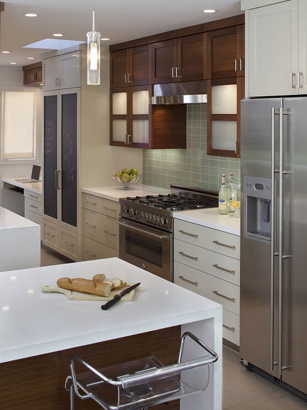
A glass backsplash gives your kitchen luminosity and adds a plus of style

Glass backsplashes have become increasingly popular over the last few years and they are still an important trend in kitchen décor. Glass is easy to clean and it also has a simple and stylish look. It scratches easily but there measures that can help you protect against that.


LED lighting.

LED lighting is a modern, energy-efficient and versatile alternative

Led lighting is very popular as well and not just in the case of the kitchen. It is used in living rooms, bedrooms, even outdoors. LED lighting is not just a modern and new option but it’s also an energy-efficient alternative that should be taken into consideration during a renovation or remodel.

High gloss look.

High gloss cabinets and kitchen islands make the room feel sophisticated

The high gloss finish suits simple and airy decors with a restraint color palette

This year the popularity of high gloss surfaces maintains its popularity in the kitchen. So if you want to give your kitchen a new look, think of getting new cabinets with a high gloss finish. If you don’t want to buy new furniture, then you can just reface the cabinets. Make them look sleek and chic by giving them a simple yet glamorous look.

Touch-activated faucets.

Touch-activated faucets are the best option at this point for several reasons

Modern and contemporary kitchens usually focus on functionality and efficiency. It’s why touch-activated faucets have become so popular lately. This year they remain in vogue so don’t hesitate to replace your old faucets with the new generation. They are very efficient and help you save water, not to mention that they’re very practical and hygienic.

Wood and solid countertops.

A wooden countertop adds warmth and texture to the decor

Stone and concrete countertops are a popular trend in modern kitchens

Solid countertops are both functional and good-looking, especially in minimalist decors

The countertops are a very important part in any kitchen’s décor. As you may have noticed, now solid countertops are popular. They give the kitchen a simple and modern look and they’re also quite functional. You can opt for wooden countertops or, if you want something a little more glamorous, for quartz. Concrete countertops are also popular.

Hardwood floors.

Hardwood flooring is very elegant and adds a unique charm to the room

Hardwood flooring is an elegant and stylish option and they remain a popular trend for 2013. They might not be great in terms of maintenance and they might also be difficult to install, but they make the kitchen feel warm, elegant and inviting. You can’t achieve the same result with other materials.

Deep bowl sinks.

Deep bowl sinks are more suitable for modern use as they can accommodate all sorts of pots and pans

A stylish sink can definitely change the look of your kitchen. For 2013, the experts recommend deep bowl sinks. They are very functional and practical because they give you more freedom of movement. They also have a dramatic visual effect on the whole décor. So consider this style for your remodel.

Incorporating kitchen appliances.

For a modern and space-efficient décor opt for built-in appliances

Since most kitchens are now focusing on space-efficient designs and functional layouts, built-in appliances are a must-have. This year makes no difference. This year’s trend is about incorporating commercial-style stoves and other appliances in the kitchen. Consider opting for stainless steel appliances and make sure you find a good spot for them.

Mixing cabinet colors.

Mix colors and finishes for a more dynamic appearance

There was a time when all the kitchen cabinets and all the other furniture in the room had to have the same finish and the same color. The situation is different now. This year you should try mixing cabinet colors. Create dynamic and vibrant décor and have fun combining your favorite shades.

Scandinavian simplicity.

Simple and minimalist kitchen décor seem more airy and clean

Minimalist and simple decors are popular for quite some time and they’re still a strong trend. So if you’re planning on giving your kitchen a makeover this year then you should try to use clean lines and to opt for the Scandinavian simplicity everyone seems to admire. The décor should be simple, enat and nicely organized.

Brass faucets.

Brass faucets are more demanding in terms of maintenance but their charm is unique

Another interesting trend this year has to do with brass faucets. They have been the subject of an increase in popularity and that’s because of their versatility and elegance. You can accessorize your kitchen stylish brass faucets regardless of the type of décor or colors used.

Picture sources: 12345678910111213, and 14.

source: Homeedite.com

A Seattle Remodel Channels Palm Springs

seattle remodelYou often hear about a house being really well built, and that was definitely the case with this remodeled 1908 Craftsman. But “well built” and “well laid out” are two entirely different things. “The whole way it was set up prevented you from having any connection to the view over Ballard, a really cute neighborhood in Seattle,” says architect and designer Charlene Wilson, of Portal Design, “or any connection whatsoever to the backyard.”

Wilson says that a lot of the inspiration for the house came from the lifestyle in Palm Springs, California. The homeowners have a vacation house there, and Wilson spent time with them in the desert and went to events during the city’s annual Modernism Week.

One of the things they all love about Palm Springs is the ability to live indoors and out, not something you can typically do in Seattle. “The sense of being able to flow from indoors to outdoors was one of the main drivers in renovating this house,” says Wilson.

See the rest at Houzz.com

Cantilevered Osaka House Hovers Over Driveway

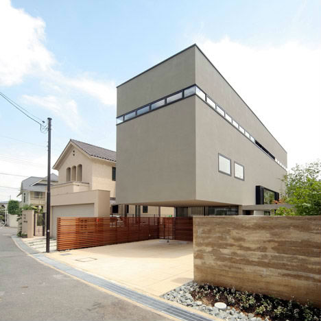
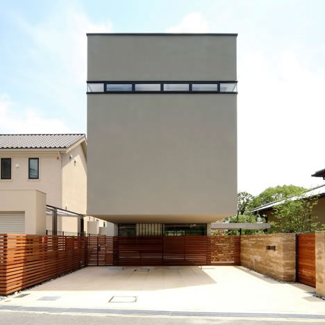
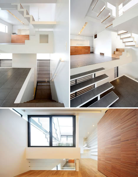
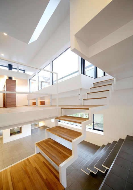
This dramatically cantilevered home in Osaka seems to defy gravity while multiplying available space, providing another example of the clever tricks employed by Japanese architects to make the most of small lots. Though the home is actually three stories tall, Shogo Iwata designed House in Senri with eight tiered interior levels.

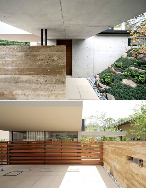
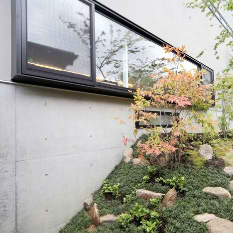
The house was stabilized with a strong visible steel frame, giving the architects the freedom to experiment with the sense of space. Like many Japanese homes, it was partially built into the ground for natural insulation, extra green space and reduced visibility of neighboring homes.

Continuing the floating effect from the outside in, the interior room platforms connected to each other with small sets of stairs create linked spaces that flow together, making the house feel much larger than it really is.

This arrangement also “makes the notion of floor ambiguous,” the architects explain, as you proceed from the entrance under the cantilevered canopy all the way to the sunny terrace on the roof.