Music Review: Diana Krall, Christmas Songs

frontFor most of my life, Christmas music was equated to work. As a music director, Christmas concerts were a big part of my job. I rarely listened to songs of the season for pleasure. Along with that is the issue, is that we have a couple of hundred songs getting played over and over and over again, like some demented Santa’s top 40. There are a handful of “must have” disks to tone down the chaos of family dinners, or serenade you during the opening of the presents.

Welcome Diana Krall to this mix. The smoothest voice in jazz hasn’t been a complete stranger to the holiday verse, releasing “Have Yourself a Merry Little Christmas” and “Jingle Bells” for past compilations. These merely hinted at what was to come from this entrancing songbird. Diana Krall takes on the classics with Christmas Songs. It’s a set that dances between the joyously upbeat (“Frosty the Snowman”) and songs of quiet contemplation (“Christmas Time is Here”). It seems to capture the ebb and flow of the season, wrapped in its tempo changes.

Krall has always been known for her crystal clear pipes, and they’ve never been quite so invigorating as with this collection. It is as if that infectious spirit of the season got her drunk on egg nog and had its merry way with her. The opening track “Jingle Bells” is a perfect example. The horns bob and weave as Krall’s voice punctuates the crescendos, flowing with passion and vigor. She’s just caught up in the rhythm, adding the decorative bow on the end “I’m just crazy about horses.”

The Clayton-Hamilton Jazz Orchestra accompanies her, and man… do they come to play. They add the kick and charisma to gas up these tunes. Just as importantly, they know their place — backing Diana. Other Christmas albums just completely forget to grab hold of the reins, and the big band just somersaults out of control, bleeding over everything.

Krall has selected a classic set that include all our sentimental favorites without getting a wild hair to take chances with the material. It’s Christmas. We want those familiar favorites we sang carols to as children and listened to those nights when Christmas Eve grew old. Whether it’s “The Christmas Song” or “I’ll Be There for Christmas,” Diana captures all the magic of a child breathlessly waiting for Santa and a family setting aside their differences and bridging the miles that separate them, to come together as one.

The only casualties of this collection await us in the disk’s closing moments. “Count Your Blessings (Instead of Sheep)” and “What Are You Doing New Year’s Eve” are fair tracks, buoyed by Diana’s effervescent vocal glow. They don’t necessarily detract from this collection, but sit as fat on the Butterball turkey that could have been trimmed. Her two shining moments are “Christmas Time is Here” and “Have Yourself a Merry Little Christmas.” “Christmas Time,” or the Charlie Brown Song as it tends to be informally known, is quiet and poignant. It just seems to whisper to the night’s sky to lose its grip on the powdered snow while the fire rages from the hearth. It comes draped in that blanket of warm fuzzy feelings. “Have Yourself a Merry Little Christmas” starts out so intimate, Diana tiptoeing in with the piano. Then the band nuzzles up beside her, dressing her heartfelt plea. It’s a beautiful piece.

Diana Krall fulfills her tremendous promise that jazz aficionados have sensed was simmering in her for many moons. She’s given us reason to get giddy about Christmas music again, which is a pretty tall order.
Warm Fusion: Country Home Combines Urban & Rural Style

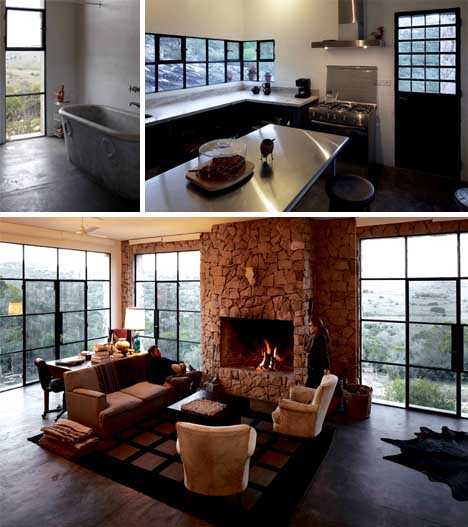
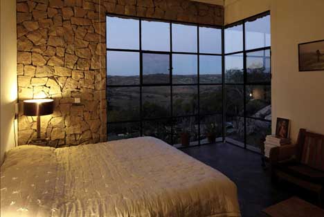
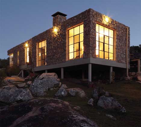
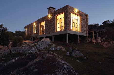
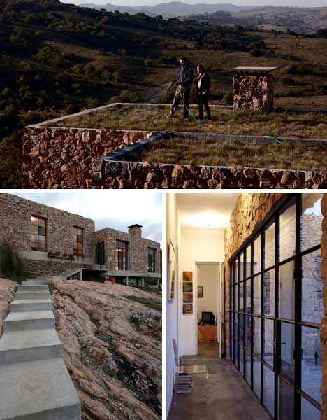
With strong International Style elements, it could be something straight out of Mies’s or Corbu’s mind, but for one of the most prominent distinguishing features: organic local-stone cladding prominently wrapping all the exterior walls, and a likewise rough-masonry rocks forming the fireplace within.

So how did this home for a New York City couple end up stitching such different design threads together? Enrique Saulle grew up in Uruguay, where it is located, but he and Pilar Acevedo brought to this project Brooklyn design sensibilities (inspiring, for instance, the thick-metal, large-panel fenestration).

Other pieces and parts came together in various ways, including trading their professional translation skills for an antique bathtub, and bringing with them stainless steel appliances from NYC to their new remote three-bedroom home and work-space retreat.

The result is a lovely medley that somehow manages to work as a hole – an International Style home on stilts (mixed with locally-quarried stones) and large urban loft windows all over, reminding one of multiple global homes … and all working together afford amazing views of the surrounding landscapes from every room in the house. (via The New York Times with images by Cristobal Palma).

In a Pinch: ‘Shaft House’ Maximizes Little 16-Foot-Wide Lot

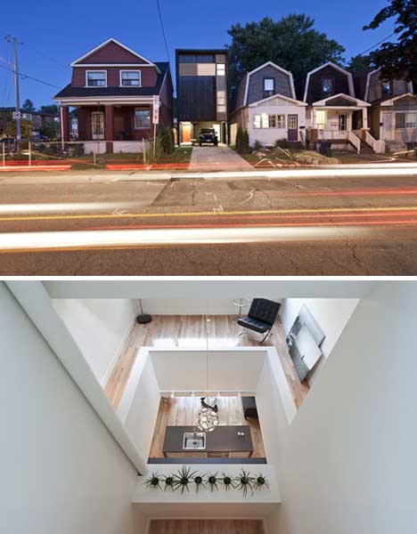
Building a new home in any city can be a tough proposition – new lots sometimes cost as much as ones with finished houses already on them. And then there are questions of neighborhood and context when it comes to materials and style, not to mention the livability issues of a small and thin lot with no real opportunity for creating side windows.

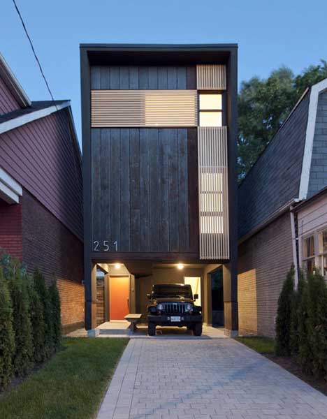
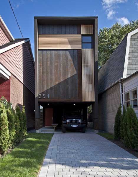
This skinny-home solution by Reza Aliabadi of Atelier Rzlbd makes the most of a tiny buildable footprint both inside and out. It even manages to look strangely at home despite (or because of) the way it departs from its pitched-roof adjacencies.

The rectangular outside shell of weathered dark wood does indeed look different from what is found around it, but is deferentially tucked back further into the lot and looks almost like a three-dimensional bookmark between classically Toronto-styled townhomes.

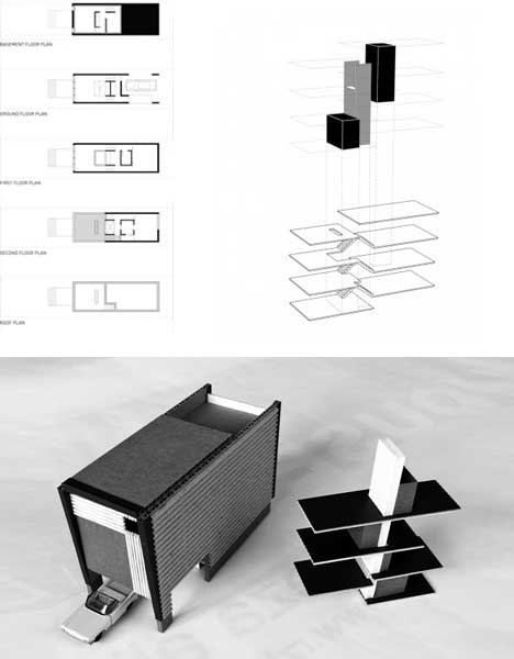
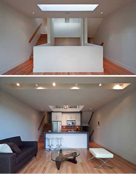
The interior is an exercise in circulation maximization – a core staircase unfolds into a series of platform-like levels spinning out from the center, facing backward of forward depending on programmatic demands and day lighting opportunities.

A simple palette of white-painted walls and richly-variegated wood floors helps keep the spaces engaging, homey but also bright and open despite the narrow configuration of the building.

A Cost Comparison of Home Ownership

To-Buy-or-Not-to-Buy-lgIn recent years, real estate has become something of a polarizing topic; there are those who argue that it’s still a worthy long-term investment with tangible benefits; and others who don’t see the value of owning a home, financial or otherwise. Regardless of which side of the argument you come out on, housing is a major part of our national economy. Furthermore, people are always going to need a place to live, so it’s a worthy discussion to be had.

There are a number of catch phrases that have become quite popular amongst real estate agents and media alike, such as “now is the time to buy” and “it’s a buyer’s market”. For some people, right now is a great time to buy a home, but for others, it’s not. The point is that buying a home is a personal decision based on each buyer’s unique circumstances. There’s no “one size fits all” model when it comes to real estate, so the best you can do is arm yourself with the right information so you can make the best decision for you.

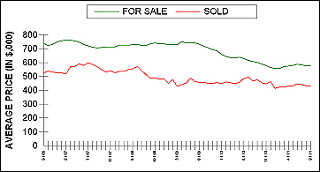
TGChartImageWith this in mind, we thought it might be interesting to compare today’s real estate market with that of 2006 when housing was at its peak. Five years ago, home values were soaring, sales were frenzied, and home ownership was at an all-time high. Inventory levels simply could not keep up with demand, so bidding wars were commonplace and homes flew off the market in record time.

Today’s market is very different. It’s important to remember that all real estate is local, so markets can vary greatly – even within a single city – but there are some general trends that we’re seeing across the board. The first is home prices; very few areas were spared from the effects of declining prices. Inventory levels in recent years have also been higher than they were in 2006 and the average amount of time that it takes to sell a home is longer. All of this points towards this being a buyer’s market. Other buyer advantages include historically low interest rates and strong affordability. With this in mind, here are some interesting stats to consider:

  • The average interest rate on a 30-year-mortgage today is 4.13%(2) and in September 2006 it was 6.41%(2)
  • A $400,000 house today would have cost $642,650 in September 2006(1) which is a difference of $242,650. *The following scenarios assume these home prices.
  • Using the above home prices and interest rates, the monthly payment today would be $1,939.76 and in September 2006 it would have been $4,024.02 – a difference of $2,084.26 per month.
  • The $2,084.26 per month savings adds up to a total of $750,333 when multiplied over the term of a 30-year loan.
  • If today’s buyer took out a 30-year-loan at the current interest rate (4.13%), but made the same monthly payments as the buyer in 2006 ($4,024.02), the loan would be paid off in just over 10 years – the buyer in 2006 would still have almost 15 more years of payments.
1) calculated using FHFA figures for the West Coast in September 2011
2) from FHLMC website for September 2011

real-estate-mathThe math above is compelling, especially when you consider how much money is saved on compound interest over the life of a 30-year loan for the same home. But regardless of what the numbers show, buying a home is much more than a financial decision, it is one that is personal and should be reflective of each individual’s needs and circumstances. Unfortunately, we don’t have a crystal ball and cannot predict what interest rates are going to do or how the market is going to grow and change, but we do know people will always need a place to call home – and as long as that is the case – we will be here to help them.

If you are interested in how this market affects you and your choices, please call me at 206-713-3244 or email Emmanuel@EmmanuelFonte.com

Church of the holy in Utrecht

church holy art

Church of the Holy Dzheykubsa Utrecht Design The former Church of St. Dzheykubsa in Utrecht (Netherlands) – municipal monument, which has a conservative facade, but it is unusual interior. Originally built in 1870, the church contains many historical treasures. The current owners have hired her architectural firm ZECC, to convert the church into the house with great attention to the light, space and functionality. The interior design was developed by Thomas Haukes. The most interesting thing that the church was sold.

church holy art

church holy art

church holy art

church holy art

Madrid Mountain Home Hovers Over Cliff & River

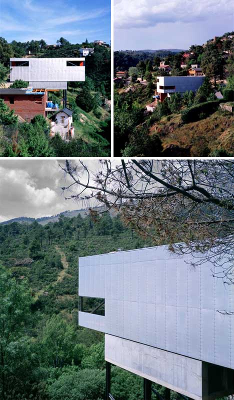
Sloped sites are notoriously difficult to deal with even in urban areas accessible by heavy building equipment … tumbling off the side of a country road, this site required creative alternative construction methods at every turn.

With physical and financial constraints, Spanish architect Arturo Franco “began to think: an iron structure like those of the visionary Russian Constructivists, a work by Tony Carr, a chair by Shapiro, a piece by Max Hill; something heavy and light at the same time; gravity, an issue; the scale, an instrument to work with; a large table or a small ship.”

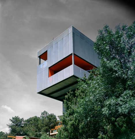
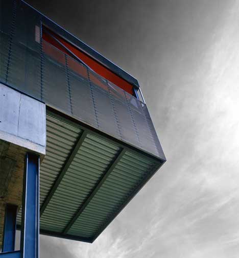
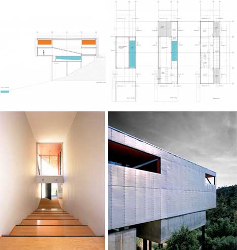
A simple box-like structure emerged, with foundations and columns of concrete supporting a wrapped-metal abode cantilevered (with secondary stilts) above. Still, building it was no simple matter, and required on-the-spot solutions evolved by contractors and subcontractors dealing the the steep terrain.

With Casa Paz, “in the end, we were searching for a linear house …. a straight line … with deep steps as in a garden, reuniting all functions. Below it, a small therapeutic pool, 2 meters wide by 10 meters long.” Behind the scenes, the entire volume is carefully balanced so that the last portion can just over 15 feet beyond the final supports from below.

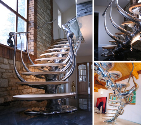
Spinal Staircases: Metal & Glass Inspired by Bone

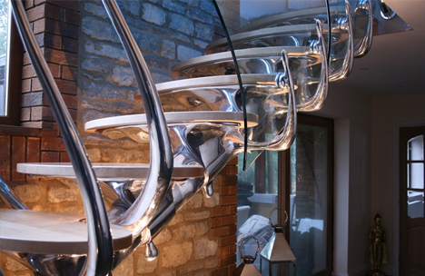
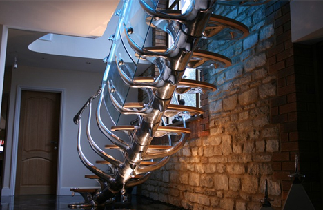
The key is context – set against a backdrop of aged brick or bright wide and bleached wood, these incredible articulated-joint stairways make for stunning centerpieces to an historic or modern home.

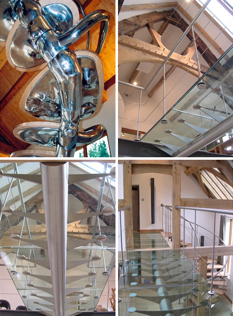
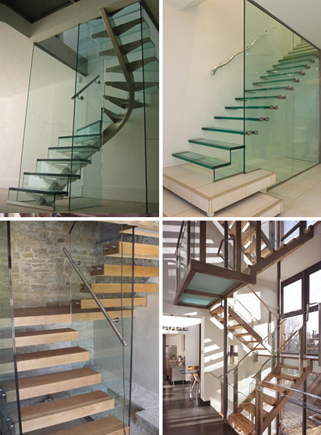
Philip Watts Design does domestic interiors and installation art, too, but their sets of stairs are particularly compelling in terms of creativity and breadth of typology.

Similar methods, simply extrapolated, were employed with the above bridge as well, in this case revealing the structure both from above and below.

Aside from the more organic, free-form, spine-shaped variety, their staircase portfolio includes a range of glass, metal and wood stairs the wrap, twist and float inside all kinds of contemporary homes.

When I’m 64! Setting Sights On Retirement

Baby boomers are far from babies now, which means as they age, they’re setting their sights on retirement. It might not be the easiest for many, though, as one-in-three Americans reports they don’t have savings for retirement past Social Security. So, what’s the plan for this enormous population? How can they get the most out of their money? For answers to these questions and more, check out CouponCabin.com’s latest infographic below.

CouponCabin_When-Im-64

Click image for larger view

Spirited Set of Wall-Mounted Bathroom Elements

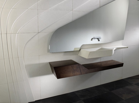
A-Cero is perhaps best known for their architecture (and one-off oddities), but has a knack for statement-making interior designs and furnishings as well – this one-off venture into bathrooms, though, certainly befits their style.

The so-called Spirit Collection created for L’Antic Colonial features a set of interlocking pieces that can be arranged like artwork on the wall – a curved glass mirror, white ceramic sink with an independent metal fixture above and organic stone-faced wooden vanity below.

What is perhaps most interesting here is the transition the designers made from their usual architectural fare, in this case blending emotive originality with modular functionality and mass-market availability.