Archives for 2014
National Foreclosure Inventory [INFOGRAPHIC]
Staircase is Like an Indoor Frozen Waterfall
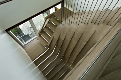
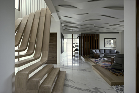
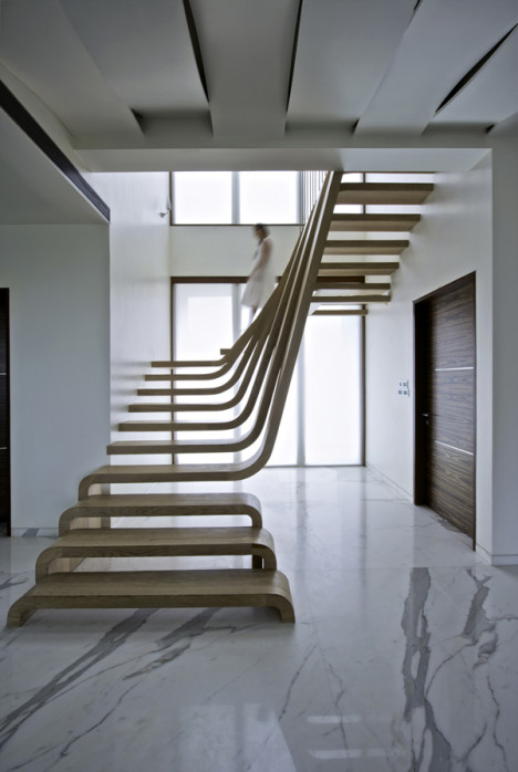 This cascading set of stairs in a Mumbai home is a perfectly executed example of architecture that mirrors nature. The wooden treads flow and curve to resemble a peaceful frozen waterfall.
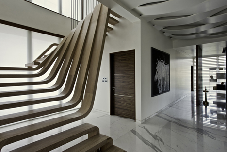
Designed by Mexican studio Arquitectura en Movimiento, the staircase is defined by continuous curved engineered walnut strips that connect the wall, the treads, and the floor without interruption.
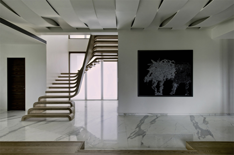
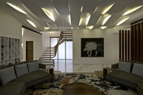
Near the bottom of the staircase, the treads are inverted U shapes, almost like raised benches on the floor. But as the stairs progress up, one end of the treads continues up to form the top portion of the staircase.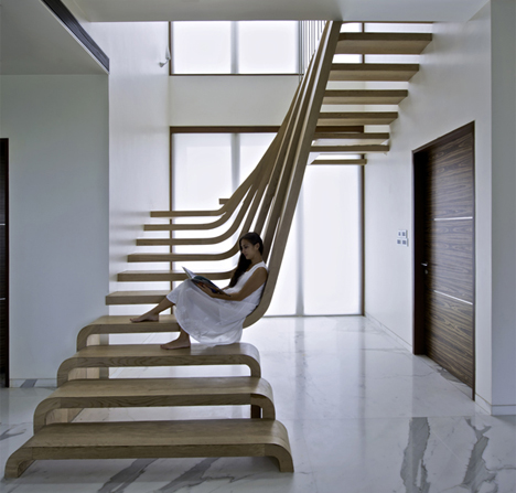 The stairs are functional, but they are also very much like a large, striking sculpture in the middle of the home’s living area. The staircase is framed by a double-height window, and its airy design allows all of that natural light to filter further into the home.
Folding Designs Make the Most of Your Space
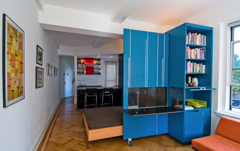 Look to furniture and doors that fold to increase usable living space without crimping your style
Remember folding tables? Many of us grew up with one in our homes. It had a simple design: Its two leaves could collapse down, leaving just a narrow central worktop, with legs neatly stowed beneath. When folded up, it left masses of space free, but could be flipped open to create a dining table to seat the whole family. What’s not to like?
Today this simple concept has been expanded and improved upon. Now folding designs crop up in every room of the home. From doors that fold away to reveal a pantry in a galley kitchen to ingenious flip-down storage, the foldaway concept works in both small spaces with confined dimensions and stylish bigger rooms with a streamlined look.
Here are 10 great ways to use designs with hinge benefits.
Who Says a Dining Room Has to Be a Dining Room?
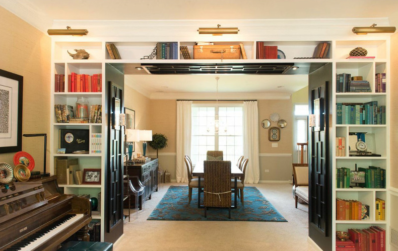 Chucking the builder’s floor plan, a family reassigns rooms to work better for their needs
Cathy Zaeske’s kids had moved on from their Lego blocks and taken up musical instruments, so it was time to get rid of the playroom that had taken over what had once been designated the dining area. Clearing things out gave her a good chance to rethink her home’s layout.
“Since the traditional dining room is right off the kitchen and has become the throughway to the screened-in porch, it receives lots of traffic and activity, not to mention the afternoon sun,” Zaeske, a decorator, explains. “I’m a big believer in designing a space for how people will live in it, not how they should live in it.” She refused to let the fact that her builder had written “dining room” on the floor plan fence her family in. And she didn’t let the same plans make her feel like she had to have a formal living room either. Repurposing and swapping spaces resulted in a functional layout tailored to her family.
PUC | WIFI MIDI INTERFACE
 Free your music from tyranny of wires with the PUC, a Wireless MIDI Connection. Designed specifically for iOS devices, the PUC allows you to wirelessly connect any MIDI device such as keyboards, synths, dj controllers, drum machines, floor pedal controllers, plus other gear, wirelessly to your iPad, iPhone or Mac, and easily control your music making apps. It has a low latency system as fast or faster than the wire, and includes the free PUC connector app.
[pb_vidembed title=”” caption=”” url=”http://www.youtube.com/watch?v=ZQiq0i0eGVM” type=”yt” w=”680″ h=”385″]
Rethinking the Master Bedroom
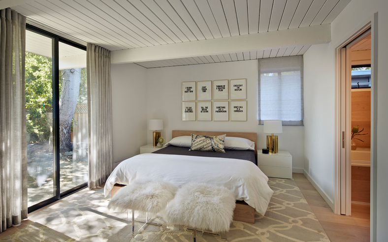 Bigger isn’t always better. Use these ideas to discover what you really want and need from your bedroom
For some time now, it’s been the norm in new construction to include an enormous master suite in the plans. Is it a blessing, or is it just overboard? The answer is, there is no cookie cutter answer — it depends on you.
Zeroing in on what you personally want and need from your master bedroom can help you build the just-right space (or tweak the one you have). These tips can help.
Yes, You Can Use Brick in the Kitchen
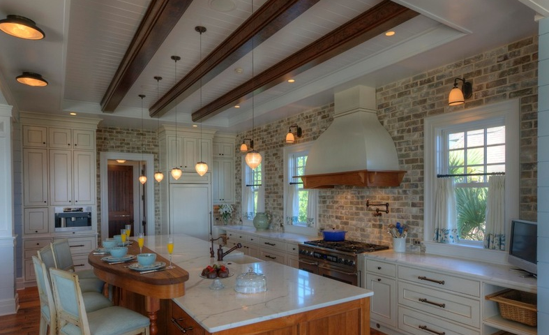 Brick can lend a wonderful historic look, warm up a kitchen or make you feel like you’re in an urban loft. On the other hand, you fear you’ll wind up with a stack of greasy, hard-to-clean masonry stacked behind your stove. Or perhaps you suspect that a thin brick veneer will look oh so faux. There’s no need to fear. Here’s the lowdown on brick and brick veneer: whether or not to seal it, how to make a brick veneer look authentic and how to maintain and clean it — it’s much easier than you think.
CASA RAMBLA | BY LAND ARCHITECTS
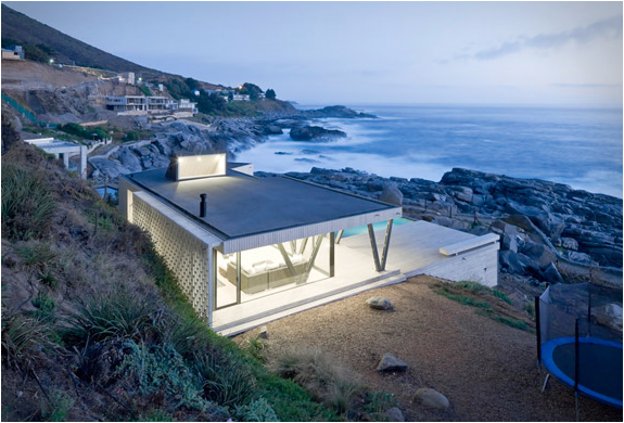
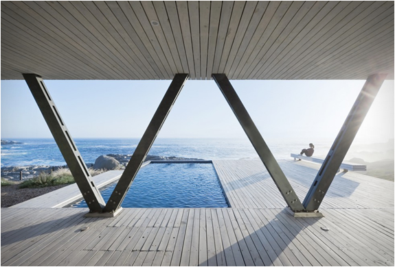
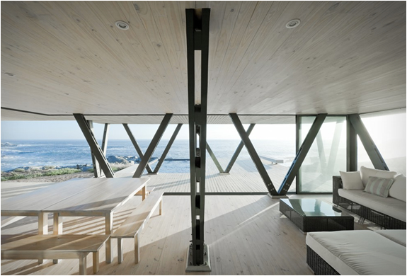
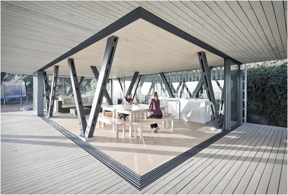
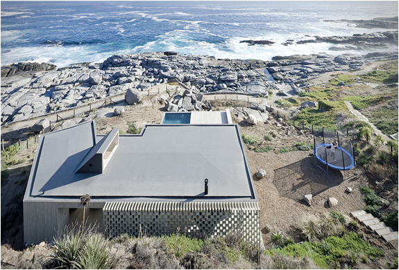
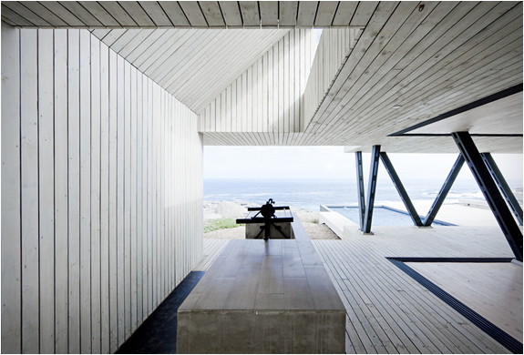
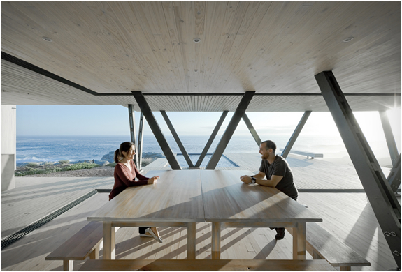
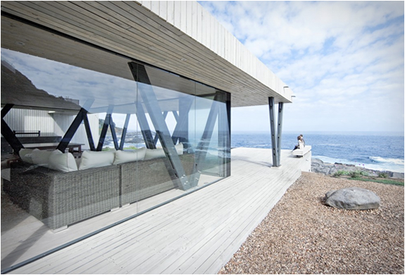
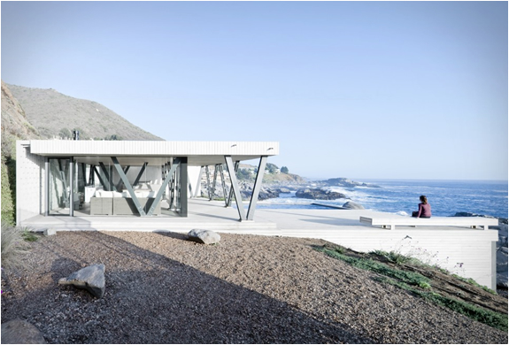
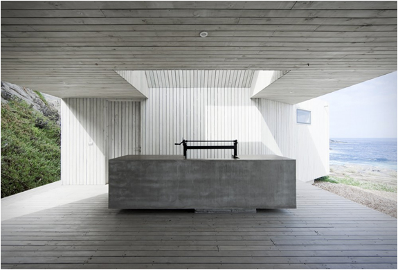
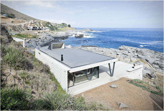
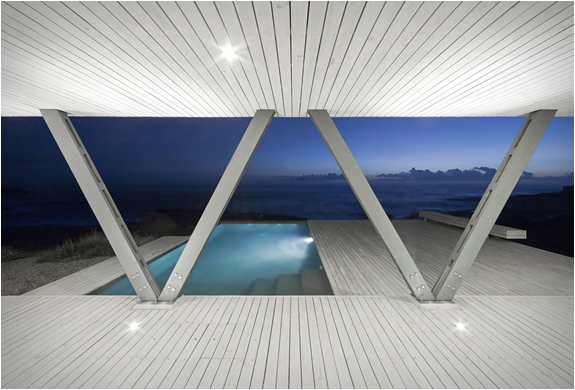
Casa Rambla is a spectacular weekend house designed by Chilean studio LAND Architects. Located on the seafront in Zapallar, a town close to Santiago, the idyllic seaside residence has an harmonious connection between indoor and outdoor spaces, making the most of the scenic location. The open space property features glazed walls on all sides so the living areas can be either completely enclosed or opened up to the elements.

