Archives for August 2014

11 Tips for Building a Bathroom in the Attic

Screen Shot 2014-08-27 at 3.44.56 PMTurn that dusty storage space into a bright, relaxing bathroom by working with your attic’s quirky spaces

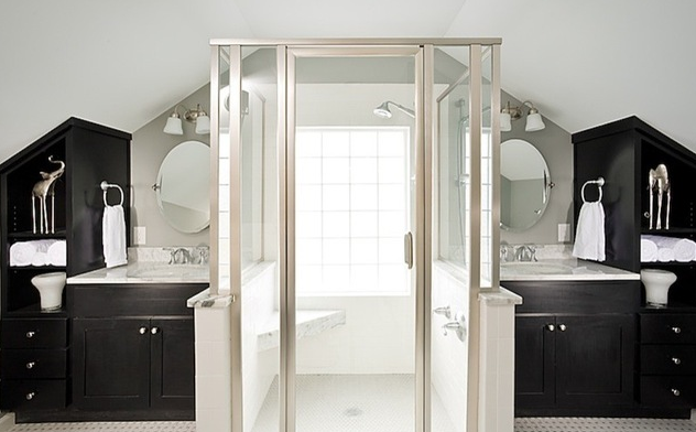
Many of us don’t have room to add a luxurious four-piece master bathroom to our homes, unless we sacrifice a spare bedroom or carve into our closet space. (Heaven forbid!) But some savvy designers and homeowners have found a smart solution: an attic renovation. A deep soaking tub tucked under an eave or a pair of pedestal sinks may just fit perfectly. Take cues from these stunning examples of beautiful bathrooms that are all found in this often-overlooked storage space.
Hidden in Plain Sight: 10 Cleverly Closeted Home Spaces

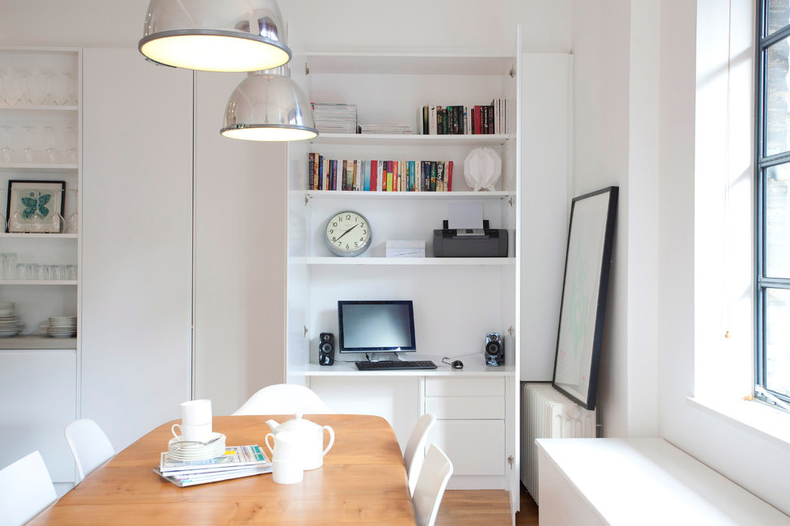
Screen Shot 2014-08-27 at 3.42.52 PMTuck your home office, wine collection or even your entire kitchen behind closed doors for all of the function and none of the clutter

Everybody loves a good closet, a place where you can shut a door to conceal clutter in one fell swoop. In that spirit, forward-thinking designers and homeowners have learned the advantage of tucking all kinds of living spaces — home offices, laundry facilities, media rooms and even kitchens — behind closed doors, keeping them out of sight (and mind) until needed.

This design technique requires you to use space in the best way possible (for instance, a stacked washer-dryer combo or a wine collection niche in the dining room). Here are some intriguing examples to inspire you in your own home.

Existing Home Sales Report

Existing-Home-Sales-Report-July

Get Turned On to a Lighting Plan

Screen Shot 2014-08-26 at 7.28.57 AMCoordinate your layers of lighting to help each one of your rooms look its best and work well for you

A well-lit room looks, works and feels better; it’s as simple as that. Whether you are starting from scratch with a new home or are looking to tailor your current space to better fit your needs, a lighting plan should be on your radar. Here’s the scoop on lighting plans — what they are, why you may want one, how to implement one and when to hire a pro.

Kitchen of the Week: Industrial Design’s Softer Side

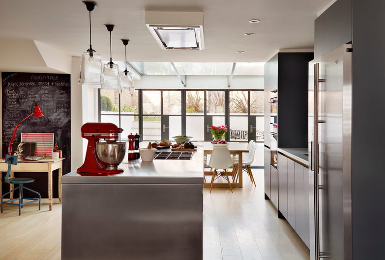
Screen Shot 2014-08-22 at 10.45.06 AMDark gray cabinets and stainless steel mix with warm oak accents in a bright, family-friendly London kitchen

The style was pretty well set when kitchen designer Jane Powell created this kitchen for Phoebe and Nick Bryans and their three kids. “Phoebe had a clear vision of what she wanted, which was design-led with a slightly industrial feel, using stainless steel and brick,” Powell says. But in addition to aesthetics, the functionality and atmosphere of the space were crucial too. “It had to be a relaxed family area,” Powell says. “Friendly and warm, not at all clinical, and somewhere that reflected the family’s personalities.”

Phoebe Bryans came armed with a mood board of images, and she and Powell worked closely together to design the space. “Her ideas were very much on the pulse of current trends,” Powell says. “One tear sheet she had featured an open shelf on an island, so we incorporated that here.”

10 Recipes for Shabby Chic Style

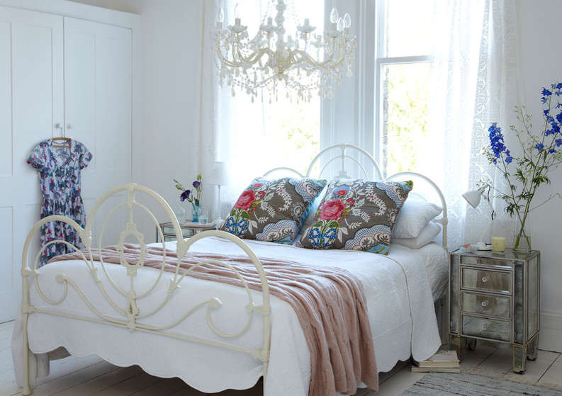
Screen Shot 2014-08-21 at 12.56.31 PMRustic furniture, floral fabrics, sparkling chandeliers. Here are 10 easy ways to bring the romantic cottage look into your home

Vintage and antique finds; distressed, cracked and imperfect finishes; antique linens; sparkling chandeliers; and lots of white. Though certainly not for everyone, for those who love the style, Shabby Chic is utter comfort and luxury. The spirit of the style is to work with what you have, enjoy the hunt for unique antique and vintage pieces, and celebrate imperfection. It’s not for everyone, but more than two decades after its rise, Shabby Chic appears among the top decorating search terms on Houzz. If you’re among those who would love to bring the look home, check out these 10 decorating combinations.

National Foreclosure Inventory [INFOGRAPHIC]

Foreclosure-Infographic

Staircase is Like an Indoor Frozen Waterfall

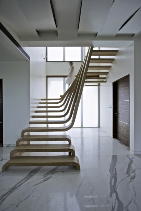
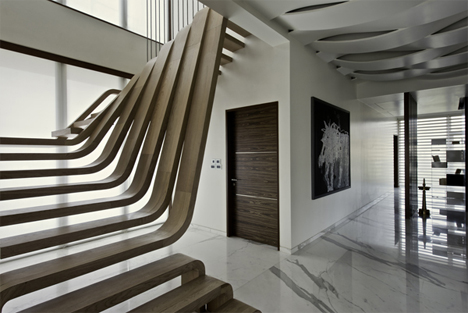
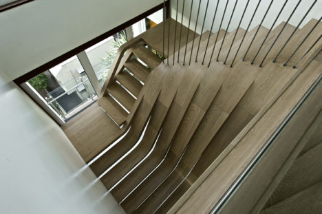
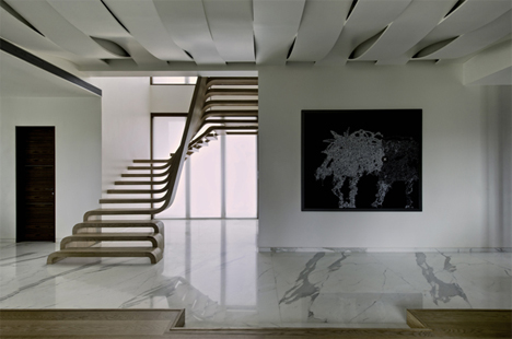
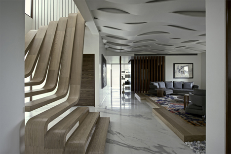
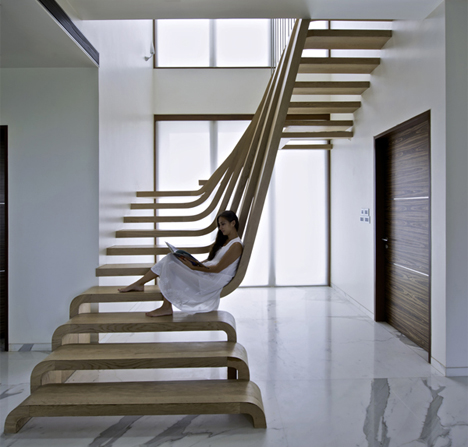
walnut-waterfall-staircaseThis cascading set of stairs in a Mumbai home is a perfectly executed example of architecture that mirrors nature. The wooden treads flow and curve to resemble a peaceful frozen waterfall.
mumbai-sculptural-wooden-curved-treads-staircase

curved-tread-waterfall-staircase-side-view

Designed by Mexican studio Arquitectura en Movimiento, the staircase is defined by continuous curved engineered walnut strips that connect the wall, the treads, and the floor without interruption.
sculptural-curved-tread-wooden-staircase

sculptural-wooden-staircase

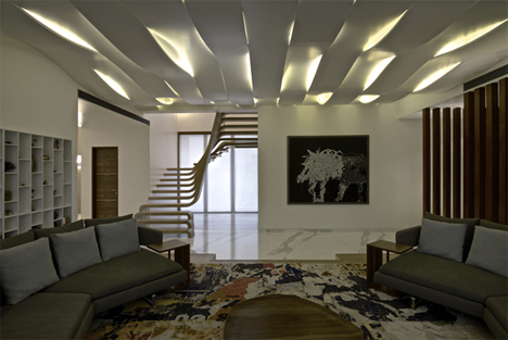
Near the bottom of the staircase, the treads are inverted U shapes, almost like raised benches on the floor. But as the stairs progress up, one end of the treads continues up to form the top portion of the staircase.curved-waterfall-wooden-staircaseThe stairs are functional, but they are also very much like a large, striking sculpture in the middle of the home’s living area. The staircase is framed by a double-height window, and its airy design allows all of that natural light to filter further into the home.
ribbon-ceiling

Folding Designs Make the Most of Your Space

Screen Shot 2014-08-20 at 9.41.38 AMLook to furniture and doors that fold to increase usable living space without crimping your style

Remember folding tables? Many of us grew up with one in our homes. It had a simple design: Its two leaves could collapse down, leaving just a narrow central worktop, with legs neatly stowed beneath. When folded up, it left masses of space free, but could be flipped open to create a dining table to seat the whole family. What’s not to like?

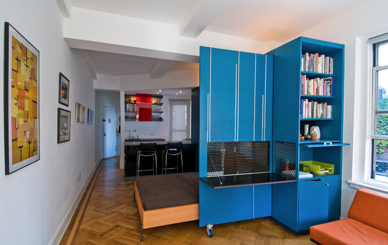
Today this simple concept has been expanded and improved upon. Now folding designs crop up in every room of the home. From doors that fold away to reveal a pantry in a galley kitchen to ingenious flip-down storage, the foldaway concept works in both small spaces with confined dimensions and stylish bigger rooms with a streamlined look.

Here are 10 great ways to use designs with hinge benefits.