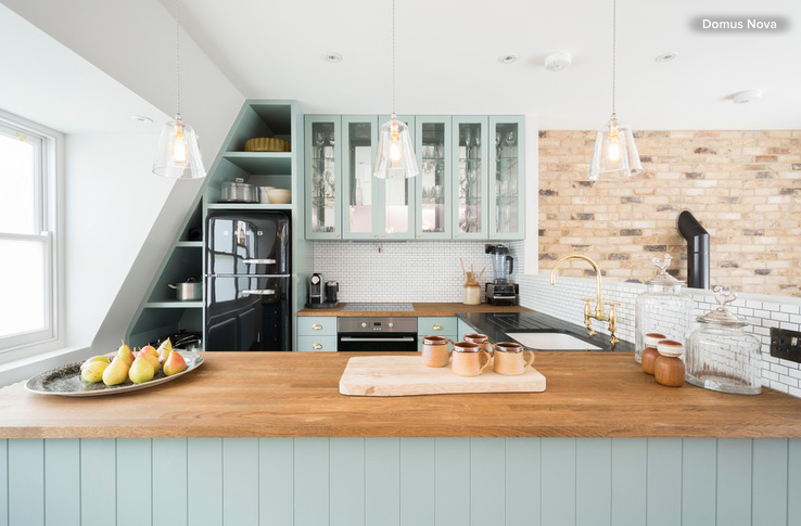
 These space-enhancing tricks can make compact cooking zones look and feel larger
Is your kitchen lovely and large, or is it on the smaller side? If it falls into the latter group, I can sympathize. I spent the better part of last year living in a studio apartment with a single-wall kitchen that was a measly 32 square feet (3 square meters). However, it wasn’t the shortage of square footage that was the problem, but rather that the cooking zone wasn’t the smartest, most efficient or space-savviest of kitchen designs. (For instance, it had no usable work area, as the sink and cooktop took up pretty much all of the countertop space.)
Since I was only renting the apartment, I couldn’t renovate the area, but that didn’t stop me from mentally writing a list of improvements I’d make if given the chance. Here are some of the design tricks I would have used to transform the spatially challenged kitchen into a cooking zone that was big on functionality, space-maximizing solutions and visual appeal, and that offered the illusion of spaciousness, too. Borrow these ideas when tackling your own cramped-kitchen makeover or, if you’ve successfully revamped a compact cooking zone for the better, share your must-try design moves in the Comments section.
Speak Your Mind